Complete Feature Guide

Master Athenum Analytics

Learn how to use all 11 professional trading tools. From orderbook analysis to prediction market arbitrage - everything you need to gain an edge.

Launch App

Trading Terminal

Live

Professional Trading Dashboard

Athenum Trading Terminal - Professional Dashboard

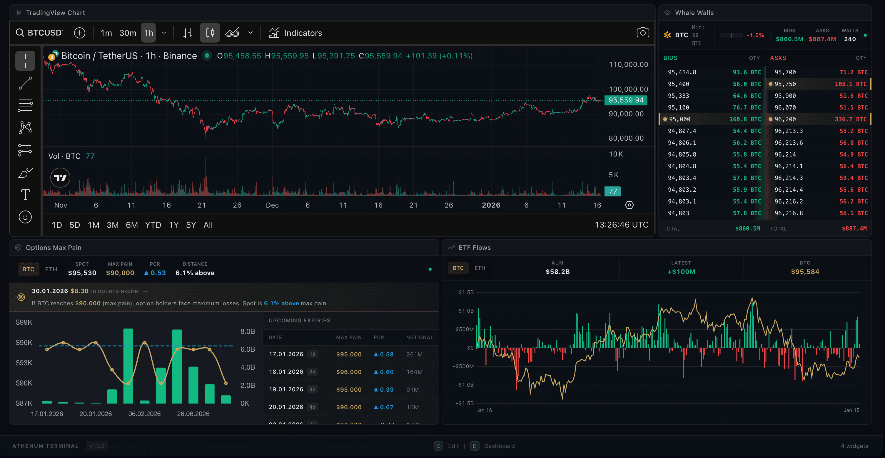
The Terminal is your fully customizable trading workspace. Drag-and-drop widgets to build your perfect layout with charts, orderbooks, whale walls, and more - all synced to your selected trading pair.

Drag & Drop Widgets

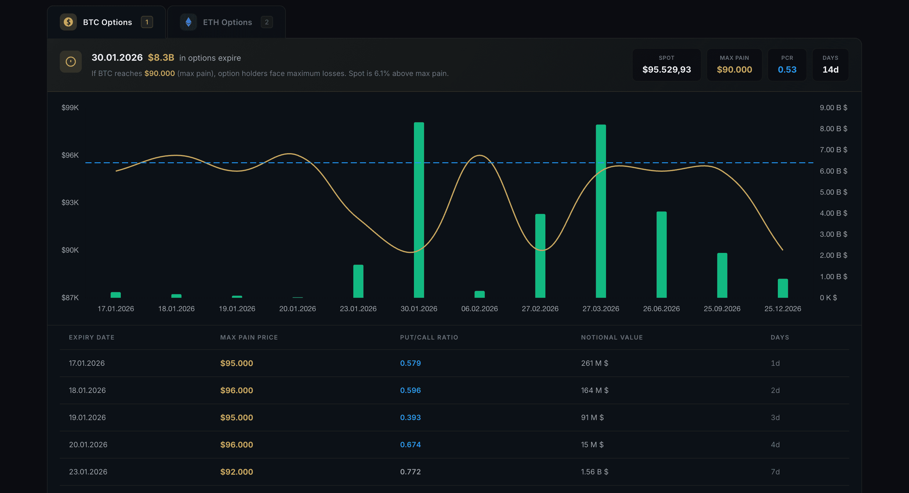
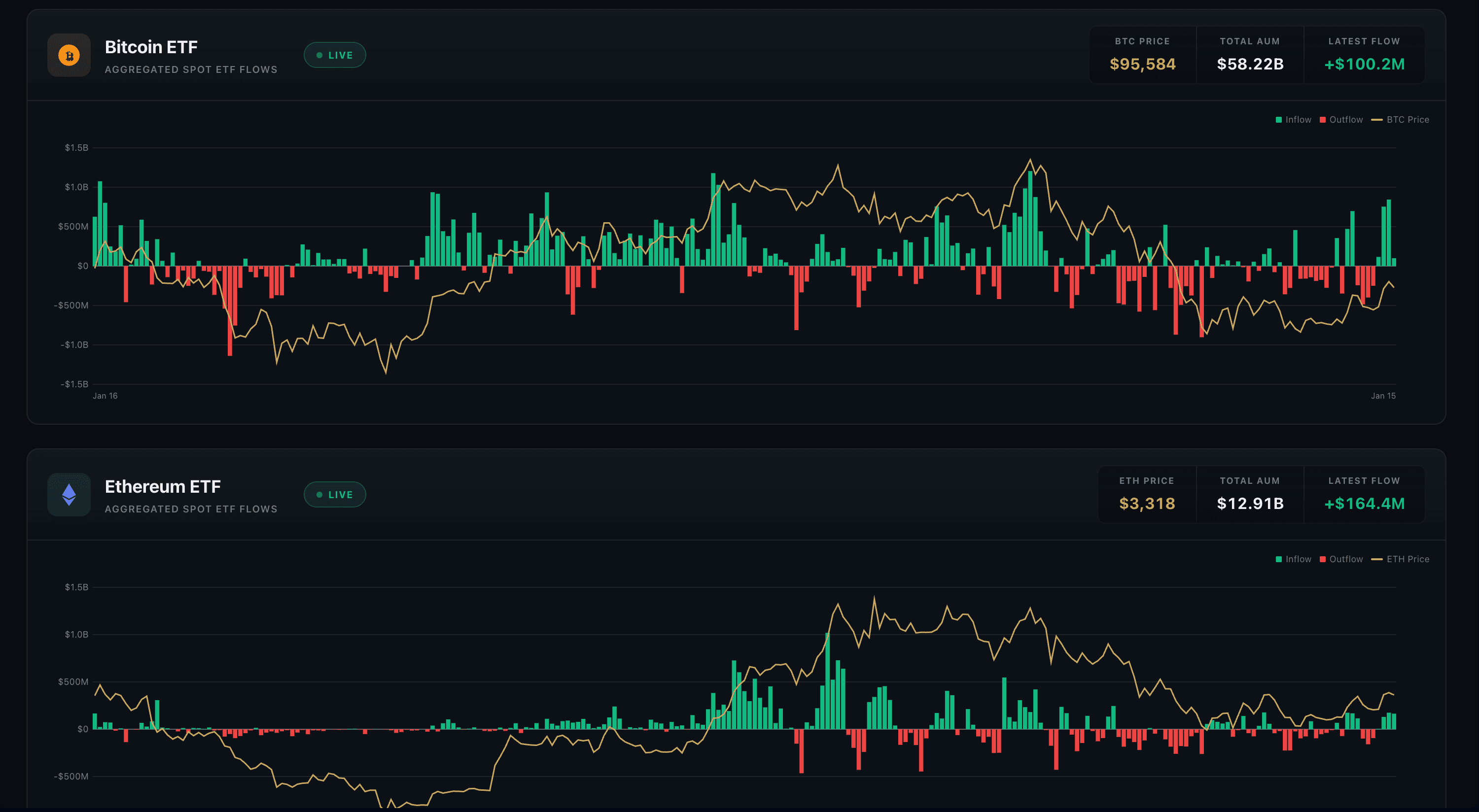
Add, remove, resize and position 6 different widget types: Chart, Order Book, Whale Walls, Trade Feed, ETF Flows, and Options Max Pain.

Layout Templates

Choose from 8 predefined layouts or create your own custom workspace and save it for later.

Symbol Sync

All widgets automatically sync to your selected trading pair - change once, update everywhere.

Keyboard Shortcuts

Press E for Edit mode to customize, D to return to Dashboard, Esc to go back.

How It Works

1

Press E to enter Edit mode and customize your layout

2

Click the + button or drag widgets from the sidebar to add them

3

Resize widgets by dragging their edges, move them by dragging the header

4

Press D to lock your layout and return to Dashboard view

Pro Tips

  • Use the Scalping template for fast orderbook-focused trading
  • The Whale Watching template combines whale walls across all exchanges
  • Save your custom layout - it persists across sessions

Orderbook

Live

Multi-Exchange Whale Wall Detection

Athenum Orderbook - Multi-Exchange View

Track whale walls (large orders) across 4 exchanges in real-time. See where big money is positioning and identify potential support/resistance levels before price reaches them.

4 Exchange Coverage

Aggregated view from Binance Spot, Binance Futures, Coinbase Spot, and Hyperliquid Perpetuals - all in one screen.

Whale Wall Detection

Large orders are automatically classified into tiers (Mega, Large, Medium) and highlighted with fill tracking.

Customizable Thresholds

Set your own minimum wall size in USD or asset amount. Different thresholds for different trading pairs.

Real-time SSE Updates

Server-Sent Events deliver wall appearances, updates, cancellations, and fills as they happen.

How It Works

1

Select your trading pair from the dropdown (10 pairs supported)

2

Toggle between Horizontal, Compact, or Aggregate view modes

3

Adjust threshold settings to filter by wall size

4

Switch between USD and asset amount display

Pro Tips

  • Watch for large walls appearing just before key price levels
  • Walls that suddenly cancel when price approaches may be spoofing
  • Use the Bid/Ask imbalance gauge for quick sentiment reads

Options Max Pain

Live

Max Pain & Put/Call Analysis

Athenum Options Flow - Max Pain Analysis

Analyze options market structure with Max Pain levels and Put/Call ratios from Deribit. Understand where market makers want price to settle at expiry.

Max Pain Levels

See the price level where the most options expire worthless for each expiry date - a key target for price action.

Put/Call Ratio

PCR for each expiry shows market sentiment - high PCR suggests bearish positioning, low PCR suggests bullish.

Multi-Expiry View

Compare max pain across all upcoming expiry dates to identify convergence zones and key levels.

Notional & Volume

Track total notional value and trading volume for each expiry to gauge institutional interest.

How It Works

1

Select BTC or ETH from the asset tabs

2

Review max pain levels across different expiry dates

3

Compare PCR values to gauge market sentiment

4

Check notional value to see where the big money is positioned

Pro Tips

  • Max Pain theory: Price tends to gravitate toward max pain as expiry approaches
  • PCR extremes (>1.5 or <0.5) often signal potential reversals
  • Focus on near-term expiries - max pain is most relevant in the final 2-3 days

ETF Flows

Live

Institutional BTC & ETH ETF Tracking

Athenum ETF Charts - Bitcoin & Ethereum ETF Tracking

Track aggregated institutional flows into Bitcoin and Ethereum spot ETFs. See 2 years of historical data with price correlation to understand how institutional money drives crypto markets.

Daily Flow Tracking

Net inflows and outflows aggregated across all major BTC and ETH spot ETFs, updated daily.

2-Year History

730 days of historical flow data lets you analyze long-term institutional accumulation patterns.

Price Correlation

ETF flows overlaid with price action - see how institutional buying/selling correlates with market moves.

Key Metrics

Current AUM, cumulative inflows, and latest daily flow displayed at a glance.

How It Works

1

Select BTC or ETH from the asset tabs

2

Green bars show net inflows (buying), red bars show outflows (selling)

3

The price line shows correlation between flows and market moves

4

Check cumulative inflow to see total institutional accumulation

Pro Tips

  • Consistent inflows over multiple days often precede price rallies
  • Large single-day outflows can signal distribution phases
  • Watch for divergence: price up but flows negative can warn of weakness

Funding Rate Heatmap

Live

Cross-Exchange Funding Rate Visualization

Funding Rate HeatmapLIVE
APR View100+ Pairs
Symbol
Binance
Bybit
Hyperliquid
BTC
+32.5%
+28.1%
+35.2%
ETH
+24.3%
+22.8%
+26.1%
SOL
+18.7%
+15.2%
+21.3%
DOGE
-12.4%
-8.9%
-15.6%
XRP
+8.2%
+6.5%
+11.4%
AVAX
+15.8%
+12.3%
+18.9%
LINK
+22.1%
+19.4%
+25.8%
ARB
-3.2%
-1.8%
-5.1%
OP
+11.5%
+9.2%
+14.3%
SUI
+45.2%
+38.7%
+52.1%
Shorts Pay
Neutral
Longs Pay
Extreme
Trapped Capital Indicator (TCI)
Detects at-risk leveraged positions
2 ALERTS
BTC Trapped Longs
High funding + price weakness
DOGE Trapped Shorts
Negative funding + price strength
Symbols Tracked
100+
Avg. Market APR
+18.4%
TCI Alerts
2

Visualize funding rates across 100+ perpetual pairs and multiple exchanges in a single heatmap view. Our Trapped Capital Indicator (TCI) detects when leveraged positions are at risk, helping you anticipate liquidation cascades and identify arbitrage opportunities.

Multi-Symbol Heatmap

Visual heatmap showing annualized funding rates (APR) across 100+ perpetual pairs in one view.

Cross-Exchange Comparison

Real-time funding rates from Binance, Bybit, and Hyperliquid displayed side-by-side for easy comparison.

Trapped Capital Indicator (TCI)

Proprietary metric detecting trapped longs (high funding + price weakness) and trapped shorts (negative funding + price strength).

Aggregated & Exchange Views

Toggle between OI-weighted aggregated view or per-exchange breakdown for detailed analysis.

How It Works

1

Use the heatmap to quickly identify extreme funding rates across all pairs

2

Watch for TCI alerts indicating trapped positions at risk of liquidation

3

Switch between Exchange and Aggregated views for different perspectives

4

Select different time periods (1h, 4h, 1d, 7d) to analyze funding trends

Pro Tips

  • Blue cells (longs pay) often indicate overleveraged long positions
  • Orange cells (shorts pay) suggest potential short squeeze setups
  • TCI alerts are leading indicators for potential cascade liquidations
  • Compare funding rates across exchanges to spot arbitrage opportunities

Range Analysis

Live

See Where The Money Is Positioned

Range AnalysisLIVE
BTCUSDT14 Exchanges
OI Profile
Open Interest by Price Level
$8.5B Total
$98.5K
$2.4B
$97.8K
$1.6B
$97.1K
$0.9B
$96.4K
CURRENT
$0.5B
$95.7K
$0.3B
$95.0K
$0.8B
$94.3K
$1.8B
$93.6K
$1.2B
Strongest Resistance
$98,500
OI: $2.4B
Strongest Support
$94,300
OI: $1.8B
OI Delta (24h)
+$340M
Bullish Positioning
BinanceBybitOKXBitgetHyperliquid+9 more
Updated 5s ago

See where the money is positioned. Our Open Interest Profile aggregates data from 14 major exchanges to reveal the exact price levels where traders have skin in the game - giving you support and resistance levels based on real capital, not just historical price.

14-Exchange Aggregation

Combined OI data from Binance, Bybit, OKX, Bitget, Hyperliquid, dYdX, and 8 more exchanges. See the complete market picture.

Real-Time Calculation

Instant profile updates as you navigate. No lag, no waiting - powered by multi-threaded processing for smooth 60 FPS interaction.

Developing POC Tracking

Watch the Point of Control migrate over time. When POC moves up, buyers are accumulating. When it moves down, sellers are in control.

Absorption Zones

Highlights where large orders absorbed aggressive selling or buying without moving price - key institutional defense levels.

How It Works

1

Select your asset and timeframe (1m to 1D supported)

2

Green bars show bullish positioning, red bars show bearish positioning

3

The POC (Point of Control) marks the price with the most activity

4

Enable Developing POC to track how value shifts over time

Pro Tips

  • High OI clusters often act as magnets for price
  • POC moving up = bullish accumulation in progress
  • Use Aggregated mode to see all 14 exchanges combined
  • Strong absorption zones often become future support/resistance

Coming Soon

These features are currently in development and will be available soon.

Sentiment Analysis

Coming Soon

Social Sentiment & Divergence Detection

Prediction Markets

Coming Soon

Polymarket & Kalshi Arbitrage Scanner

Funding Rates

Coming Soon

Cross-Exchange Funding Rate Monitor

Futures Analysis

Coming Soon

Perpetual Futures & Derivatives Analytics

CME Gap Detector

Coming Soon

CME Futures Gap Analysis