트레이딩 터미널
라이브프로페셔널 트레이딩 대시보드
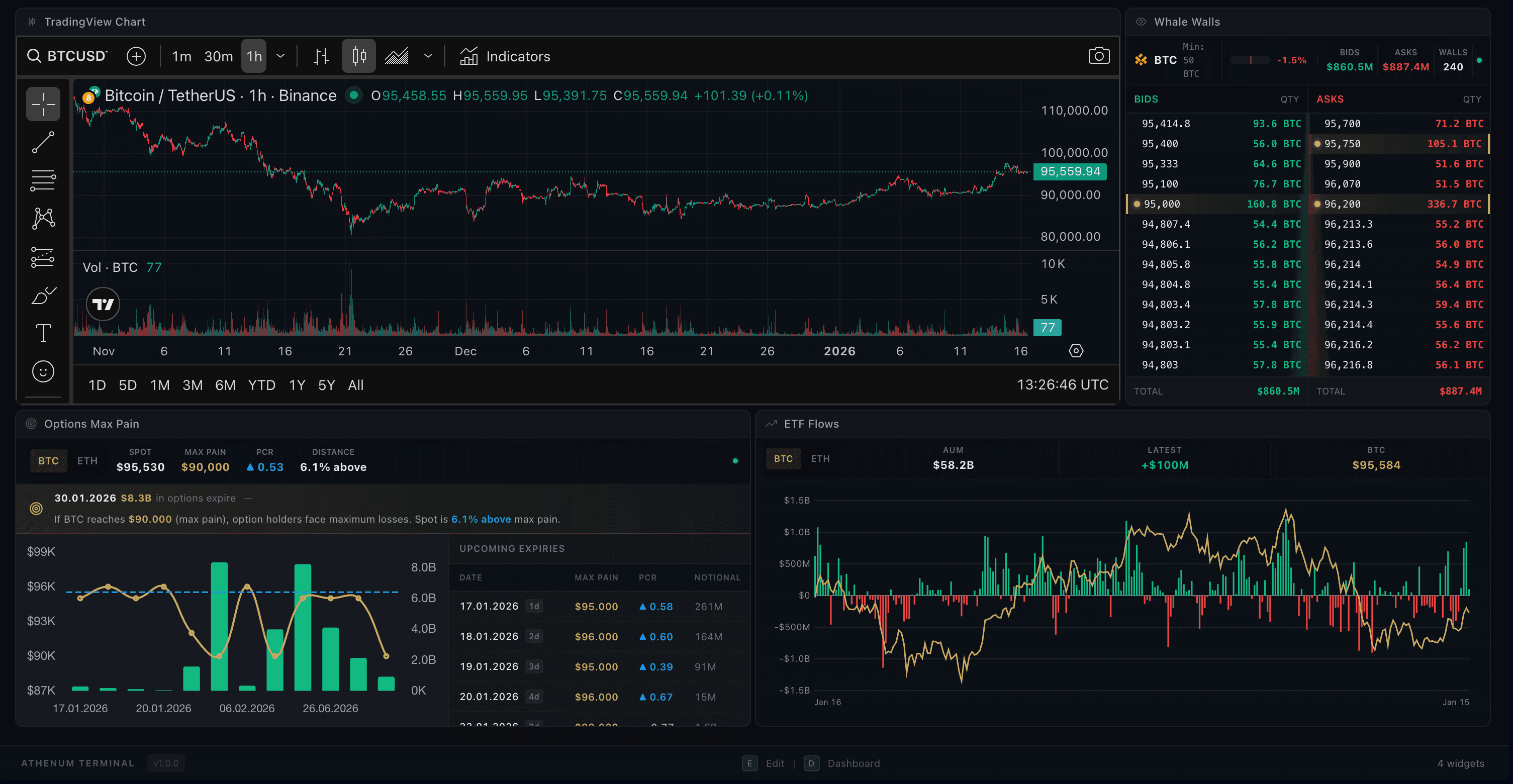
터미널은 완전히 커스터마이징 가능한 트레이딩 작업 공간입니다. 드래그 앤 드롭 위젯으로 차트, 오더북, 고래 벽(Whale Walls) 등을 배치해 나만의 완벽한 레이아웃을 구성하세요. 모든 위젯이 선택한 거래 페어에 동기화됩니다.
드래그 앤 드롭 위젯
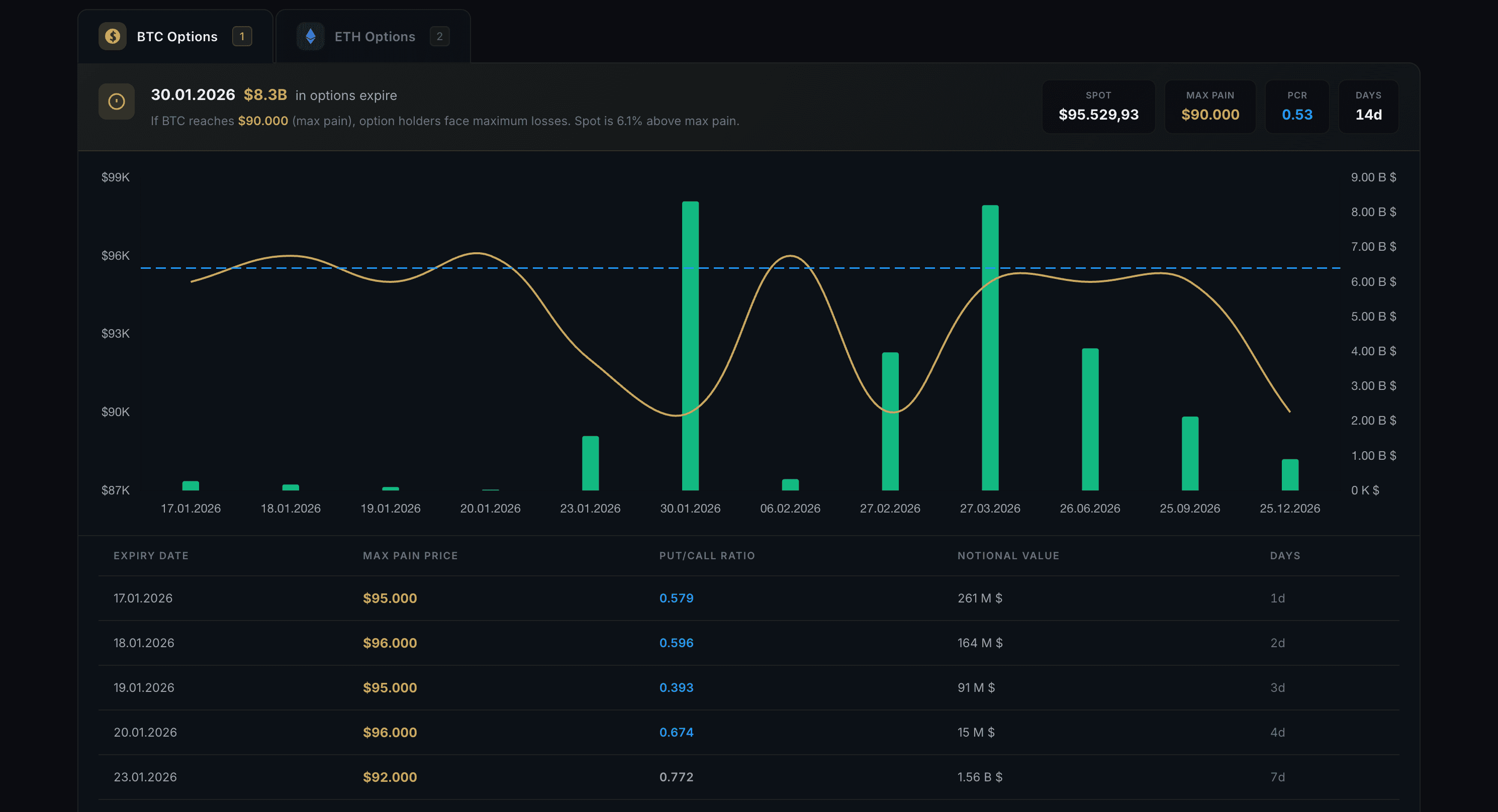
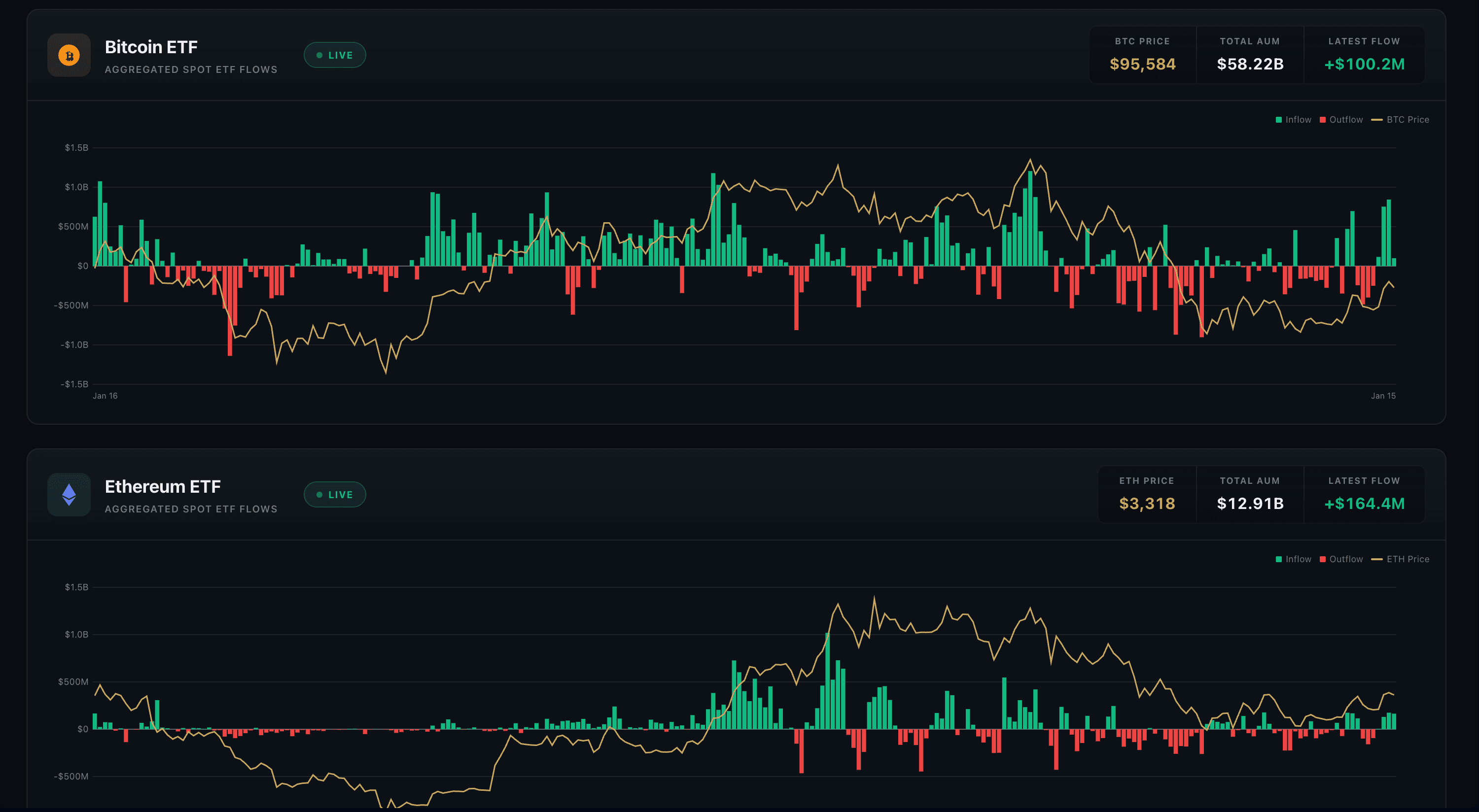
6가지 위젯 유형을 추가, 제거, 크기 조절, 배치할 수 있습니다: Chart, Order Book, Whale Walls, Trade Feed, ETF Flows, Options Max Pain.
레이아웃 템플릿
8가지 사전 정의 레이아웃 중에서 선택하거나, 나만의 작업 공간을 직접 만들어 저장해 두고 나중에 다시 사용하세요.
심볼 동기화
모든 위젯이 선택한 거래 페어에 자동으로 동기화됩니다. 한 번만 바꾸면 모든 곳에 반영됩니다.
키보드 단축키
E를 눌러 편집(Edit) 모드로 커스터마이징하고, D로 대시보드(Dashboard)로 돌아가며, Esc로 이전으로 이동합니다.
사용 방법
1
E를 눌러 편집 모드로 진입하고 레이아웃을 커스터마이징하세요
2
+ 버튼을 클릭하거나 사이드바에서 위젯을 드래그해 추가하세요
3
위젯의 가장자리를 드래그해 크기를 조절하고, 헤더를 드래그해 위치를 옮기세요
4
D를 눌러 레이아웃을 고정하고 대시보드 화면으로 돌아가세요
프로 팁
- 빠른 오더북 중심 트레이딩에는 Scalping 템플릿을 사용하세요
- Whale Watching 템플릿은 모든 거래소의 고래 벽을 한데 모아줍니다
- 커스텀 레이아웃을 저장하세요. 세션이 바뀌어도 그대로 유지됩니다