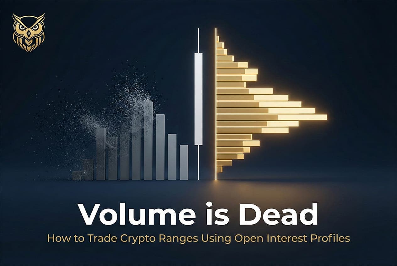
Volume is Dead: How to Trade Crypto Ranges Using Open Interest Profiles
In a market where 75% of all crypto trading is leveraged derivatives, using spot volume to define support and resistance is like navigating with an outdated map. This guide breaks down how Open Interest Profiles reveal where leverage is truly concentrated, why "high volume nodes" are often ghost levels with no one left to defend them, and how to spot trapped trader fakeouts before they liquidate your account.
I. The Range Trap and the Volume Illusion
Here is the uncomfortable truth that nobody on Crypto Twitter will tell you: most traders make money in trends and bleed it all back during sideways chop.
You know the cycle. Bitcoin rips 30% in two weeks. You catch a piece of it. You feel sharp, confident, maybe even invincible. Then the market enters a range. Price bounces between the same two levels for days, sometimes weeks. You try to trade it. You buy what looks like support. You short what looks like resistance. You get stopped out. Again. And again. And again.
By the time the next real trend arrives, the range has eaten everything you made and then some.
This is not bad luck. This is not poor discipline. This is a structural problem with the tools you are using. Specifically, the Volume Profile.
The false prophet
For decades, the Volume Profile has been the gold standard for identifying support and resistance. The logic seems bulletproof: if a massive amount of trading occurred at a specific price level, that level must represent strong market consensus. Buyers and sellers agreed that price was "fair" there. When price returns to that level, the theory says those same participants will defend their positions, creating a wall of support or resistance.
In traditional equities and forex, this framework works reasonably well. Reported volume is regulated, exchanges are consolidated, and the data is relatively clean.
In crypto? That logic falls apart completely.
The first reason is that crypto spot volume is catastrophically unreliable. Research from Bitwise Asset Management submitted directly to the SEC found that up to 95% of reported Bitcoin spot volume was fake or non-economic wash trading. A subsequent Forbes investigation of 157 exchanges concluded that roughly 51% of daily Bitcoin trading volume was likely fabricated. Academic work published in Physica A used Benford's Law analysis and confirmed systematic volume fabrication across major exchanges. This is not a fringe claim. It is one of the most thoroughly documented facts in crypto market structure.
The second reason is even more important: spot markets no longer drive crypto price discovery. Derivatives do. And it is not even close.
By 2025, cryptocurrency derivatives volume reached approximately $85.7 trillion annually, representing roughly 75 to 79% of all centralized exchange activity. Perpetual futures alone account for about 78% of all derivatives trading. On Binance specifically, the ratio of perpetual futures to spot volume on BTC has reached approximately 12:1. Think about what that means. For every dollar of spot Bitcoin changing hands, twelve dollars of leveraged perpetual contracts are being traded.
When three quarters of all crypto trading is in leveraged derivatives, using a spot volume profile to define support and resistance is like navigating with a map from 2015. The roads have changed. The terrain has changed. And the people who still trust the old map keep driving off cliffs.
The thesis
There is a better way to read sideways markets. Instead of tracking where trades happened, you need to track where leveraged positions still exist. Instead of volume, you need Open Interest.
This article will show you exactly how Open Interest Profiles work, why they expose fakeouts that volume profiles miss entirely, and how to use them to stop getting chopped up in ranges. We will walk through real market data and real liquidation cascades to prove the concept. And by the end, you will understand why the "high volume node equals strong support" playbook is costing you money.
II. Open Interest vs. Traditional Volume: The Core Distinction
Before we get tactical, you need to understand what Open Interest actually is and why it tells you something fundamentally different from volume.
What Open Interest measures
Open Interest (OI) is the total number of outstanding derivative contracts that have been opened but not yet closed, settled, or delivered. The CME Group, which has been publishing futures education for decades, defines it as the indicator that shows "cash flowing into or out of the market."
Every derivative contract is a two sided agreement. One person goes long. Another goes short. That creates one unit of Open Interest. When both sides close their positions, that unit disappears. This means OI only changes when genuinely new positions are created or when existing positions are permanently destroyed.
Here is the critical difference: volume counts every transaction regardless of intent. Open Interest only counts net new risk entering or leaving the market.
A single high frequency bot can generate millions of dollars in "volume" by buying and selling the same contract thousands of times in a single session, finishing the day with zero net exposure. That activity adds massively to volume. It adds nothing to Open Interest.
A single whale opening a $50 million long position barely moves the volume needle in a market doing billions per day. But it adds $50 million to Open Interest. That position now has margin locked up, a liquidation price, and a funding rate obligation. It is real capital at real risk.
This is why Open Interest is structurally harder to fake. Wash trading volume costs nearly nothing because you buy and sell simultaneously at market fees (often zero during promotional periods). "Wash trading" Open Interest would require actually maintaining open positions with real deposited margin, exposing yourself to mark to market losses, funding payments, and potential liquidation. No rational actor does this at scale.
Visualizing the difference
Both Volume Profile and OI Profile display data as horizontal histograms along the Y axis (price levels). Visually, they look similar. But what they measure is completely different.
A Volume Profile shows you where the most trades were executed. The widest bars (High Volume Nodes) cluster at prices where the most transactions occurred. The single price with the highest traded volume is called the Point of Control.
An OI Profile shows you where the most open positions currently exist. The widest bars cluster at prices where the most margin backed contracts are still active.

Athenum Range Analysis: BTC/USDT on Binance. The horizontal OI Profile bars reveal where leverage was concentrated across the entire Jan to Feb range. Orange bars represent one side of the positioning; blue bars the other. The POC at $67,998 marks the price level with the highest aggregate open interest.
When these two profiles agree (high volume and high OI at the same price), you have genuine participation and real support or resistance. Traders actually have skin in the game at that level and are financially incentivized to defend it.
When they diverge (high volume but low OI at a price), you are looking at a ghost. The activity happened, but nobody stayed. Maybe it was bots churning. Maybe it was profit taking. Maybe it was a zero fee promotion inflating numbers. Whatever the cause, there is no remaining capital at that price with any reason to defend it.
This is the "ghost node" problem that destroys range traders. You see a towering high volume node on your chart and assume it is iron clad support. Price touches it and slices straight through because every position that created that volume has already been closed. The footprint is there, but the people are gone.
Why high OI nodes act as magnets and reaction zones
When Open Interest concentrates at a specific price level, three things happen that create powerful market reactions:
First, stop losses cluster. Every leveraged position has a stop loss or liquidation level. When thousands of traders enter positions at similar prices, their protective orders stack up in a narrow band. This creates a dense pocket of resting liquidity just beyond the entry zone.
Second, market makers adjust. Professional liquidity providers are constantly delta hedging around areas of high open interest. They know where the leveraged positions are, and they adjust their quoting behaviour accordingly. This creates observable price "stickiness" around high OI zones.
Third, and most importantly, liquidation cascades become possible. When price moves against a dense cluster of leveraged positions, forced liquidations begin. Each liquidation is a market order that pushes price further against the remaining positions, triggering more liquidations, which triggers more selling, which triggers more liquidations. This self reinforcing loop is the engine behind every violent fakeout and flash crash you have ever witnessed in crypto.
Open Interest does not just show you where support and resistance are. It shows you where the explosives are buried.
III. The Anatomy of an Open Interest Range
Now that you understand what OI measures, let's break down the two sub metrics that make it tradeable in sideways markets.
Total OI: the crowd size
Total OI is the absolute number of open contracts at any given moment. Think of it as the number of people currently inside a stadium. It tells you how crowded the venue is, how much energy is in the room, and how much potential there is for chaos if something goes wrong.
When Total OI is rising, new capital is entering the derivatives market. Traders are placing bets. Leverage is building. The "stadium" is filling up. When Total OI is falling, positions are being closed, either voluntarily through profit taking or involuntarily through liquidation. The crowd is thinning.
In a range, watching Total OI gives you an immediate read on whether the consolidation is building pressure or releasing it. If price has been bouncing between $90,000 and $100,000 for two weeks and Total OI keeps climbing throughout, you know that leverage is accumulating. Both longs and shorts are piling in. Stop losses are stacking up on both sides. The longer this continues, the more violent the eventual breakout (or fakeout) will be.
This is the "pressure cooker" dynamic. A range with rising OI is not a calm market. It is a coiled spring, loaded with potential energy in the form of leveraged positions that will eventually be forced to close.
OI Delta: the secret weapon
OI Delta is where the real edge lives. It measures the net change in Open Interest over a specific period. If OI increases from $500 million to $505 million, the OI Delta is +$5 million. That means $5 million in new long positions and $5 million in new short positions were opened. If OI decreases from $500 million to $490 million, the OI Delta is negative $10 million, meaning $10 million in longs and $10 million in shorts exited the market.
Think of Total OI as the balance of a bank account. OI Delta is today's net deposits or withdrawals.
This distinction matters enormously for range trading because OI Delta tells you whether a price move is being driven by new conviction or old liquidation. And those two scenarios lead to completely different outcomes.
The standard interpretation framework, corroborated across CME Group educational materials, Glassnode research, and Binance's own derivatives documentation, works like this:
Price rising + OI rising (positive OI Delta): New longs are entering the market. This is genuine bullish conviction backed by fresh capital. The uptrend has structural support.
Price rising + OI falling (negative OI Delta): Shorts are being squeezed. Price is going up, but not because new buyers believe in the move. It is going up because trapped shorts are being forced to buy back their positions. Once the short squeeze is exhausted, the rally dies.
Price falling + OI rising (positive OI Delta): New shorts are entering. The downtrend has energy and conviction behind it.
Price falling + OI falling (negative OI Delta): Longs are being liquidated or voluntarily closing. The selling pressure is fading as positions unwind. Once the weak hands are flushed, the selling tends to exhaust itself.
In a range, these four scenarios play out at every boundary test. And the difference between "new money entering at resistance" and "old shorts getting squeezed into resistance" is the difference between a real breakout and a fakeout that is about to ruin your week.
IV. The Strategy: Spotting the "Trapped Trader" Fakeout
This is the part that pays for everything else. Let's walk through exactly how OI profiling reveals trapped leverage in real time, using the mechanics we just covered and anchoring everything in documented market data.
The setup: how ranges load the spring
Every range begins the same way. Price finds a ceiling it cannot break and a floor it cannot crack. Over days or weeks, traders take sides. Longs accumulate near the bottom of the range, placing stop losses just below support. Shorts accumulate near the top, placing stop losses just above resistance.
As the range matures, Open Interest climbs steadily. Every new position adds more stop losses and more liquidation levels to the pile. These clustered orders form dense "liquidity pools" resting just outside the range boundaries, invisible on a standard chart but perfectly visible through OI analysis.
Institutional participants, quantitative funds, and algorithmic market makers know exactly where these pools sit. They have the data. And they need that liquidity to fill large orders without suffering catastrophic slippage. This is why ranges do not break cleanly. They fake out first, harvesting the liquidity on one side before moving in the real direction.
The fakeout scenario: anatomy of a trap
Let's paint the picture with a concrete sequence.
Bitcoin has been consolidating between $90,000 and $100,000 for three weeks. Open Interest has been climbing steadily throughout the range, rising from $42 billion to over $60 billion. Funding rates are elevated, sitting around 15% annualized, a clear signal of aggressive long positioning.
Then it happens. On a random Tuesday, Bitcoin punches above $100,000 and keeps going. It hits $103,000. Then $103,500. Crypto Twitter explodes. "New all time high!" screams every feed. Retail traders who have been watching from the sidelines panic. They cannot afford to miss this move. They market buy Bitcoin with 10x, 20x, sometimes 50x leverage, entering at $101,000, $102,000, $103,000.
Reading the Delta: the footprint of the trap
This is the moment that separates OI literate traders from everyone else.
If you are watching your OI Profile during this breakout, you see something alarming. OI Delta spikes violently positive. Tens of billions of dollars in new contracts are being opened in a matter of hours. A massive High OI Node is forming above $100,000. The breakout is not being driven by institutional accumulation or organic spot demand. It is being driven by late retail leverage, FOMO fueled and highly concentrated at the worst possible prices.
Meanwhile, the smart money is doing the opposite. They are absorbing this aggressive retail buying by stacking limit sell orders above $100,000. The standard volume delta might show heavy market buying, but price completely stalls. It cannot push higher despite the flood of new long orders. This is the tell.
When you see a massive spike in positive OI Delta at the extreme of a range, combined with elevated funding rates and stalling price momentum, you are looking at a textbook trapped trader scenario. Those breakout longs are about to become fuel for the reversal.
The cascade: where the money is made (and lost)
The unwind follows a predictable, mechanical sequence.
Profit taking from traders who were long from lower prices creates the initial selling pressure. Price dips back below $100,000. This first dip triggers margin calls on the newest, most leveraged breakout longs. Their forced liquidations (automated sell orders) push price lower.
Lower prices hit the liquidation thresholds of progressively deeper long positions. Each cascade of forced selling triggers the next. Liquidity providers and market makers pull their bids, widening spreads and accelerating the decline. The order book thins out precisely when the market needs depth the most.
Price does not just return to the range. It plunges through it.
The December 2024 $100K Fakeout: a textbook case
This is not a hypothetical scenario. It played out almost exactly as described in December 2024, producing one of the largest liquidation events since 2021.
The buildup. Following Trump's re-election in November 2024, Bitcoin rallied from approximately $67,000 into a defined consolidation range of $90,000 to $99,000 through late November and early December. Open interest climbed steadily, having already set a record of $42.6 billion in late October and continuing to rise as the range developed. Funding rates hit 15% annualized during this period.
The breakout. On December 4 to 5, Bitcoin surged above $100,000 to an all time high of approximately $103,900. BTC futures open interest spiked to a new record above $70 billion, up roughly 65% from just five weeks earlier. The positive OI Delta was massive: tens of billions in new contracts opened as traders rushed to ride the breakout.
The failure. On December 5, Bitcoin plunged from $103,900 back to $97,000 within hours, erasing the entire breakout. The first wave delivered over $1 billion in total crypto liquidations, with $565 million in BTC positions specifically.
The cascade. On December 9, a second, deeper crash sent Bitcoin to an intraday low of $94,129, roughly 9.4% below the all time high set just four days earlier. This wave was devastating: $1.52 billion in total crypto liquidations in 24 hours, of which $1.39 billion (91.4%) were long positions and only $137 million were shorts. $759 million was liquidated in a single hour during the most intense period. The largest individual liquidation was a $12.74 million BTC/USDT swap on OKX.
Combined across both waves, the event produced approximately $1.7 billion or more in total liquidations. BTC open interest collapsed from above $70 billion to roughly $40 billion over the following months, a decline of more than 40%.
What OI analysis would have shown you. Traders watching only price and volume saw a breakout above the most psychologically significant level in Bitcoin's history and bought the top. Traders watching the OI Profile would have seen weeks of leverage crowding into the upper range, a late and aggressive spike in OI Delta above $100,000 (the hallmark of trapped retail FOMO), no prior OI accumulation base above the old range (meaning no "real" structural support above $100K), and OI collapsing on the first sign of failure.
That combination is not a signal to buy. It is a signal to fade or stand aside entirely.
The execution: how to trade the trap
The strategy is not "buy where OI is high" or "sell where OI is low." In ranges, you are specifically looking to fade failed breakouts where leverage has piled in on the wrong side. Here is the practical framework:
Define the range. Identify the consolidation structure: repeated highs, repeated lows, compression zone. Note the upper and lower boundaries clearly.

Athenum Range Analysis: Key horizontal levels on BTC/USDT derived from OI node analysis. Each line represents a zone where significant open interest accumulated. Notice how price repeatedly reacted to these levels during the multi-week decline, bouncing and stalling exactly where the OI data predicted.
Monitor OI buildup. Watch Total OI throughout the range. Rising OI during consolidation means the spring is loading. The longer OI climbs while price stays flat, the more violent the eventual move.
Wait for the breakout attempt. When price pushes beyond a range boundary, immediately check OI Delta. Is it spiking positive? Are new positions flooding in at the extreme? Check funding rates. Are they elevated or extreme? These are signs of crowding.
Identify the failure. If price breaks out but immediately stalls, especially while OI is spiking, the breakout is suspect. If price then re-enters the range and OI begins to compress (positions closing), the trap is confirmed.
Fade the failure. Enter against the trapped side. If the failed breakout was to the upside, short the re-entry back into the range with a stop above the breakout high. Target the range midpoint first, then the opposite boundary if the full rotation develops.
The behavioural edge is clear: you are not trading the breakout. You are trading the trapped leverage created by the breakout attempt. Those trapped traders' stop losses and liquidation levels become the fuel for your trade.

Athenum Range Analysis: BTC/USDT on 15M, Feb 15 to 24. The POC at $67,998 from the broader range's OI Profile acts as resistance, rejecting price multiple times before the eventual breakdown. The horizontal levels above and below the POC mark additional OI concentration zones. When price finally lost these levels, the cascading liquidation took BTC from $68,000 to below $63,000 in days.
Contextualizing with CVD: the confirmation layer
For traders who want maximum precision, pairing OI Delta with Cumulative Volume Delta (CVD) creates a high resolution picture of market intent. CVD measures the net difference between aggressive market buys and aggressive market sells.
When price is rising, OI is increasing, and CVD is positive, you have an organic uptrend. Aggressive buyers are opening new positions with conviction.
When price is rising, OI is increasing, but CVD is flat or negative, you have a dangerous divergence. New positions are being opened, but limit sellers are absorbing every market buy. Price is going up on thin air. This is the fingerprint of institutional absorption and a strong signal that the breakout is being set up as a trap.
When price is falling and OI is decreasing with negative CVD, you are watching a long liquidation cascade. Trapped longs are being forced out. The drop will exhaust itself once the liquidity cluster of stop losses is cleared.
This three layer framework (price + OI Delta + CVD) eliminates most of the ambiguity in range trading. You are no longer guessing. You are reading the market's positioning in real time.
V. The Pivot: Why You Need the Right Tool
If you have read this far, you understand the framework. You know that Open Interest is the signal that matters in a derivatives dominated market. You know how to read OI Delta to distinguish real breakouts from fakeout traps. And you know that the December 2024 $100K collapse was a textbook example of what happens when traders ignore leverage positioning.
The question now is: how do you actually execute this?
The friction: the modern trader's nightmare
The honest answer is that doing this properly on existing platforms is a logistical nightmare.
Here is the current workflow for a serious intraday trader who wants to use OI analysis in ranges. You open TradingView for price action and traditional technical analysis. Then you open CoinGlass in another tab to monitor aggregate Open Interest as a line chart. Then you open a third tab for funding rate data from Binance or Bybit. Maybe a fourth for liquidation heatmaps. And a fifth for order flow analytics.
Five tabs. Three logins. Two different definitions of "open interest" depending on which platform is computing it. And none of these tools talk to each other.
The data latency alone kills your edge. In a market where liquidation cascades unfold in minutes and fakeouts reverse in seconds, alt tabbing between browser windows to cross reference OI with price action is not a strategy. It is a handicap.
Then there is the visual disconnect. The human brain is not designed to map a time series OI line chart in one window to specific price levels on a candlestick chart in another window. To spot a trapped trader node, you need to mentally transpose the OI spike onto the exact price wick where the positioning occurred. This manual transposition is error prone, slow, and frankly absurd in 2026.
And let's talk about cost. Subscribing to multiple premium data feeds, each offering some fraction of the picture, creates a subscription burden that eats into your trading capital before you even place a trade. $50 here for advanced charting. $100 there for derivatives data. Another $30 for order flow. You are paying $200+ per month for a fragmented experience that still requires you to do the hard work of synthesis manually.
The solution: unified OI range analysis
This is exactly why we built Athenum.
We did not build another data aggregator. There are enough dashboards showing you numbers without context. We built a unified analytical platform that puts Open Interest profiling, OI Delta visualization, funding rate context, and price action on a single screen because that is what this strategy demands.
When you trade a range on Athenum, you see the OI Profile plotted directly on the Y axis alongside price, just like a Volume Profile, but measuring where leverage is concentrated instead of where trades printed. You have already seen this in the screenshots throughout this article: the orange and blue histogram bars mapping exactly where positions accumulated, the POC level at $67,998 acting as the gravitational center of the range, and the horizontal OI levels catching every major bounce and breakdown. You see OI Delta in real time, color coded to show whether new positions are flooding in (the setup for a trap) or draining out (the confirmation of a flush). You see funding rates and directional premium overlaid so you know which side is crowding the door. And you see it all aggregated across major exchanges: Binance, Bybit, OKX, and more, normalized into a single coherent view.
No more five tabs. No more mental transposition. No more paying for three subscriptions that each give you one third of the picture.
What this looks like in practice
Remember the December 2024 setup? Imagine trading that range with Athenum open instead of your fragmented stack.
You would have seen OI climbing steadily throughout the $90K to $99K range, directly on your chart. You would have seen the OI Profile showing thin positioning above $100K: no accumulated base, no structural support. When the breakout launched, you would have watched OI Delta spike aggressively positive above $100K in real time, with funding rates already at extreme levels. And when price stalled at $103K despite all that new leverage, you would have seen the divergence immediately: massive positioning, zero follow through.
That is not a breakout. That is a trap. And you would have known it in real time, on one screen, without stitching together data from five different platforms.
The bottom line
Once you accept that ranges are a leverage game, you stop hunting for "high volume support" and start hunting for where open interest was built. And that only works if your charting, OI, and funding data sit in the same place.
Stop trading blind. Stop paying for three different tools that each show you a fraction of the picture. Start tracking trapped leverage natively.
Sources: CME Group Futures Education, Glassnode On-chain Research (LPOC Framework, Week On-chain Reports), Kaiko Derivatives Research, CoinGlass Liquidation Data, Bitwise Asset Management SEC Filing (2019), Forbes Crypto Exchange Investigation (2022), Bank for International Settlements Working Paper #1087, NBER Working Paper #16712, CryptoQuant OI Variation Research, Hyblock Capital Academy.
Range Analysis
98,200
98,050
97,900
97,750
97,600
97,450
POC AT 97,900 (14 EXCHANGES)
See where the money actually is
OI profile aggregated from 14 exchanges. Real positions, not predictions. Find the levels that actually matter.
Try Range AnalysisNo credit card required