Table of Contents8 sections
- How concentrated in time are Bitcoin liquidations?
- Does an independent feed see the same shape?
- What does a big liquidation hour actually look like?
- Are Bitcoin liquidations mostly long or mostly short?
- Does one violent hour predict the next one?
- Which hours of the UTC day carry the risk?
- How do you check this yourself?
- What did today look like?
Practise with worked lessons
- Normalize liquidation side labels before comparing venues
Distinguish the liquidated position from its closing order. Reconcile opposite provider conventions before adding long and short liquidation quantities.
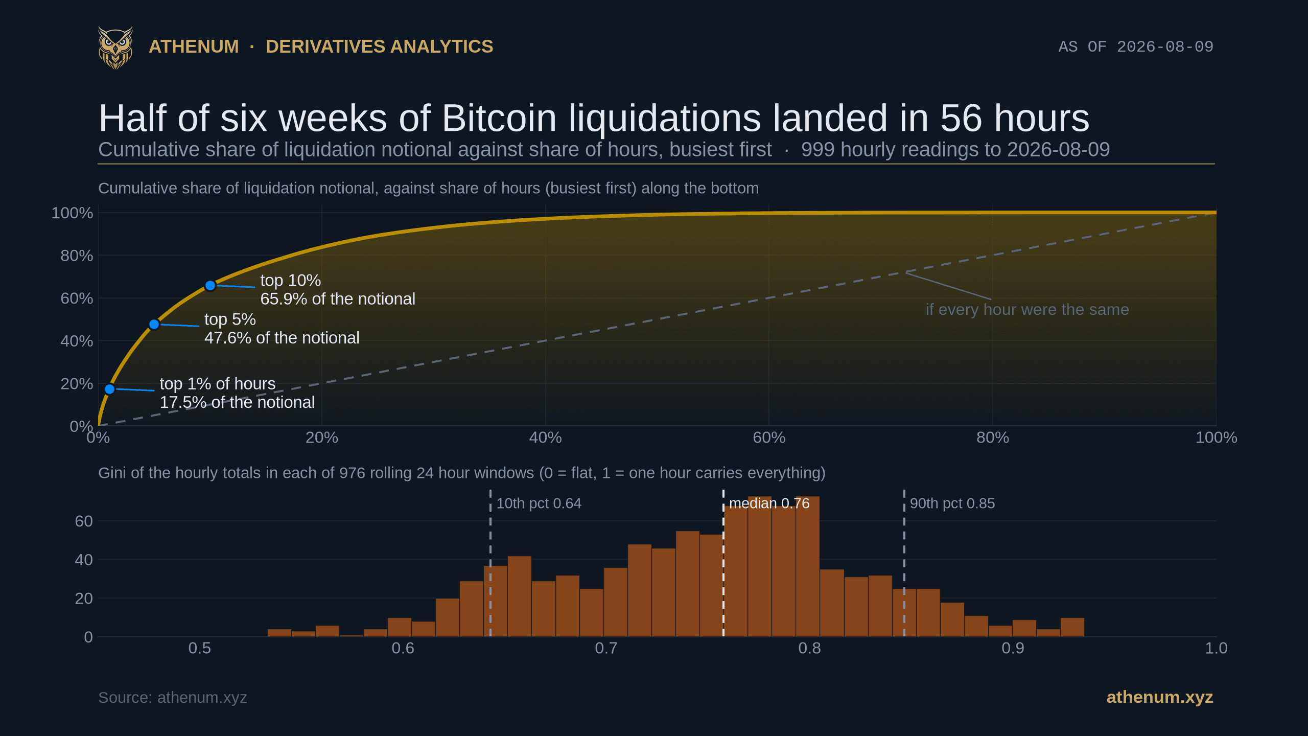
TLDR. Bitcoin liquidations do not arrive at a steady rate, and the gap between the typical hour and the hours that matter is larger than most risk framing assumes. Across 999 completed hourly readings from Athenum's aggregated Bitcoin perpetual liquidation feed, 2026-06-28 17:00 UTC to 2026-08-09 07:00 UTC, half of all the notional landed in 56 hours and a quarter of it in 18 hours. The busiest 1% of hours carried 17.5%, the busiest 10% carried 65.9%, and the median hour was $113,170 against a mean of $925,105, a ratio of 8.2 to 1. Two things fall out of that. Almost every hour is one way: among the 536 hours where both sides appear at all, the median hour put 96.9% of its notional on a single side (interquartile range 85.4% to 99.8%), while the whole panel pooled together is a nearly balanced 47.1% long against 52.9% short. And the crowding is not evenly spread across the clock either: 12:00 to 15:00 UTC carried 38.0% of the notional on 16.4% of the hours. The single worst hour of the day, however, is not established, and we show below exactly why our own ranking fails its own resample.

Cumulative share of Bitcoin perpetual liquidation notional against share of hours, busiest first, over 999 completed hourly readings to 2026-08-09 07:00 UTC. The dashed diagonal is what an even distribution would look like. The lower panel is the same concentration measure computed separately inside each rolling 24 hour window, so the spread of the measure is visible rather than assumed.
How concentrated in time are Bitcoin liquidations?
Extremely, and the numbers are worth stating plainly before any interpretation. Over 999 completed hourly readings covering 41.6 days to 2026-08-09 07:00 UTC, the top 18 hours carried a quarter of all the liquidation notional in the window, the top 56 hours carried half of it, and the top 144 hours carried three quarters. The bottom half of the hours, roughly 500 of them, carried 1.1% between them. The Gini coefficient of the hourly totals is 0.801. That is not comparable to a national wealth Gini, and it would be sloppy to pretend otherwise, because the unit here is an hour we chose rather than a person: bucket the same data by day and it falls to 0.391, by week to 0.095. Inside this panel it is simply the compact way of saying that the ranking is extremely top heavy. Nor is 0.801 an exotic reading in its own right. Any bursty flow measured in fine buckets lands near it: one published study puts the concentration of daily trading volume across S&P 500 constituents between 0.56 and 0.77, and yearly studies of daily rainfall routinely report higher. A Gini of 0.801 corresponds to a Pareto tail exponent of about 1.1, which is an ordinary heavy tail rather than a discovery.
Share of the notional | Hours it took | Share of the 999 hours |
|---|---|---|
25% | 18 | 1.8% |
50% | 56 | 5.6% |
75% | 144 | 14.4% |
90% | 260 | 26.0% |
The obvious objection is that one bad day is doing all the work, so we tested it. The largest single day in the window, 2026-07-06, carried 8.8% of the panel on its own. Delete that entire day and the Gini falls only from 0.801 to 0.795, with the top 1% of hours still carrying 15.9%. Delete just the single largest hour and it falls to 0.797. This is not one event with a long quiet tail. It is a shape that reproduces at every scale you cut it at.
The spread matters as much as the headline, so the lower panel of the chart above shows it directly. Computing the same Gini separately inside each of the 976 rolling 24 hour windows in the panel gives a median of 0.758, a 10th percentile of 0.643 and a 90th percentile of 0.846. The lowest reading in the whole six weeks is 0.533. There is no such thing here as an evenly distributed day: concentration varies, and it never goes away.
One number in this section is not what it looks like, and it is the only one we would ask you not to quote. The panel total is $924.2 million, and that is what these public feeds published, not a census of what the market actually liquidated. The earlier Athenum post on why a reported liquidation number is a floor rather than a total takes that mechanism apart at source: a throttled feed keeps one print per symbol per second and drops the rest, and the venue documentation cannot even agree with itself about which print it keeps. Every other figure in this post is a share of that total rather than the total itself, and that is deliberate. A share is unchanged by an undercount applied evenly. This undercount is not even: it bites hardest in the busiest seconds, which is where the concentration lives, so the concentration reported here is a floor as well.
Does an independent feed see the same shape?
Yes, on the one day it can be checked, and this is the part a reader can reproduce without an account. OKX publishes its own filled liquidation orders on a public endpoint, event by event with a timestamp and a size, and it served roughly the last day of them when we pulled it. That gives 106 filled BTC-USDT swap liquidations covering 2026-08-08 09:00 UTC to 2026-08-09 07:00 UTC, which is a separate, and separately incomplete, measurement of the same day from a venue rather than from an aggregator.

OKX's own public liquidation orders against the Athenum aggregated feed, each hour as a share of that feed's own total, over the completed hours from 2026-08-08 09:00 UTC to 2026-08-09 07:00 UTC. The lower panel places both readings inside the distribution of every rolling 24 hour window in the six week panel: an ordinary day, not a crash.
On that shared day, OKX's own data gives a Gini of 0.800 and ours gives 0.752, both computed the same way on a dense hourly grid so quiet hours count as zeros. Both feeds name the same busiest hour, 2026-08-09 07:00 UTC, and the rank correlation between the two hourly series is 0.690, which falls to 0.497 once the five hours in which both feeds record nothing at all are dropped, so part of that agreement is agreement about quiet. OKX's 0.800 sits at the 76th percentile of our 976 rolling windows, so the day it happens to cover was an ordinary one rather than a selected crisis.
Four honest limits, because a control that is only quoted when it agrees is not a control. One, the OKX feed is not a total either, and the route we used is not in its current reference. The REST path api/v5/public/liquidation-orders answers, but that string does not appear anywhere in OKX's live v5 documentation today; the documented sibling is the liquidation orders websocket channel, whose description says in as many words that this data does not represent the total number of liquidations on OKX. So its 0.800 is a floor for exactly the reason ours is, and the agreement here is about shape rather than level. Two, twenty three completed hours is a short window, and it is about the longest that route will serve for a perpetual swap. Three, the two feeds cover different venue sets, so they disagree about individual hours: only one of their respective top three hours is the same hour, and our aggregate sees flow at 21:00 and 01:00 UTC where the OKX feed sees almost none. Four, the conversion assumes OKX's published contract size, which its own instruments endpoint returns as 0.01 BTC per contract for this symbol, and values each event at the only price OKX publishes for it, the price of the transaction with its liquidation account.
What does a big liquidation hour actually look like?
It looks like one side being removed from the market, and almost never like a two sided washout. The largest hour in the panel, 2026-07-06 21:00 UTC, carried $28.4 million, which is 3.1% of the entire six weeks in sixty minutes, and 99.9% of it was short positions. Of the ten biggest hours, nine put at least 97% of their notional on one side, and two of them recorded nothing at all on the other.

The ten largest hours in the panel, long and short legs stacked, with the percentage on the dominant side above each bar. The dashed line is the median hour of the 999 at $113,170, which at this scale is indistinguishable from the axis. That distance is the whole point.
The median hour is drawn on that chart as a dashed line and it sits on the floor. That is not a rendering problem, it is the finding: the typical hour is about 250 times smaller than the hour that ends up in the headlines.
Are Bitcoin liquidations mostly long or mostly short?
Both, and neither, and the answer depends entirely on the window you pool over, which is the most practically useful thing in this post. Pool all 999 hours and the split is 47.1% long against 52.9% short, near enough to balanced that it looks like a market with no directional bias at all. Look at the individual hours and that balance disappears completely. Of the 536 hours in which both sides appear at all, the median hour put 96.9% of its notional on a single side, with an interquartile range of 85.4% to 99.8% and 67.4% of them at or above 90%. A further 395 hours recorded one side only, and 68 recorded nothing.

Median share of the hour on its larger side with interquartile band, by decile of hour size. Two series, because the all-hours series is partly one sided by construction: 395 hours have only one side reported. Restricting to the 536 hours where both sides appear still gives a median of 96.9%. The orange line is what the same data look like pooled: 52.9% short.
We expected the big hours to be the one sided ones and that turned out to be wrong, which is why the chart is drawn by decile rather than as a single average. Among the hours where both sides appear, the quietest decile has a median of 86.7% on the larger side and the busiest has 99.8%. Size buys a little more one sidedness and not much; the effect is present at every size, including hours worth a few hundred dollars. So the honest statement is not "cascades are directional", it is "hours are directional", which is a broader and duller claim than the one we set out to make.
We can put a number on what that does to a trailing split, using our own published record. On 2026-08-03 an Athenum panel of the previous 168 hours read $97.9 million of longs against $53.0 million of shorts, or 64.9% long. The same feed, over a 168 hour window of the same length ending 2026-08-09 07:00 UTC, reads $20.5 million long against $55.8 million short, or 26.9% long. Nothing structural changed in six days. The window simply picked up a different mixture of one way hours. It is the same effect the earlier Athenum post on liquidation data as a floor recorded when a trailing split moved from 98.6% long to 47.6% long in 96 hours and called it a fast moving trailing statistic. The mechanism is that there is no stable number underneath for a trailing window to converge on.
Does one violent hour predict the next one?
It does, by a factor of about three and a half, but the episodes end quickly. Take the busiest 10% of hours, which by construction is 99 hours out of 999. After an hour that is in that group, the next hour is also in it 27 of 99 times, or 27.3%, with a 95% interval of 19.5% to 36.8%. After any other hour it happens 72 of 899 times, or 8.0%, interval 6.4% to 10.0%. The two intervals do not overlap and an exact test puts the difference below p = 0.001. Those intervals treat consecutive hours as independent, which they plainly are not, so we re-ran them as a circular block bootstrap over 24, 48 and 72 hour blocks: the first widens to roughly 17% to 35% and the second stays between 6% and 10%. They still do not overlap.

Probability the next hour also lands in the busiest 10% of hours, with 95% intervals. The dashed line is the 10% unconditional rate. The run length breakdown on the right is the necessary qualifier: the 99 busiest hours fall into 72 separate runs and 56 of those are one hour long.
The qualifier belongs in the same breath as the result, because on its own the three and a half times figure invites the wrong conclusion. Those 99 hours fall into 72 separate runs, and 56 of the 72 are a single isolated hour. Ten runs last two hours, three last three, two last four, and exactly one lasts six. So the elevated probability is real and it is also short lived: the most likely thing to follow a violent hour is still a quiet one, roughly seven times out of ten.
Which hours of the UTC day carry the risk?
The afternoon UTC block does, and this is where we have to argue against our own first draft. Summed across the panel, 12:00 to 15:00 UTC carried 38.0% of all the liquidation notional across 164 of the 999 hours, which is 16.4% of them. Testing that against a flat clock would be too easy, because the block was picked by looking at the data. So the test is the harder one: reshuffle the hour of day labels 5,000 times and each time take the best contiguous four hour block the shuffle produces. Under that null the best block reaches a median of 22.0% and never gets past 31.5%, and the observed 38.0% was not matched in a single one of the 5,000 shuffles. The quietest hour of the day, 10:00 UTC, carried 0.6%.

Share of the panel's liquidation notional by hour of the UTC day, and how often each hour is the busiest across 2,000 resamples of the 43 calendar days. The block is stable. The ranking inside it is not: 13:00 UTC tops the raw table but wins only 53% of resamples, and ten different hours win at least once.
Now the part that cuts against the table. 13:00 UTC tops the raw ranking at 11.1% of the total, and that ranking is not established. Resample the calendar days and 13:00 is the busiest hour in only 53% of the 2,000 resamples; 12:00 UTC wins 24% of them, and ten different hours win at least once. With 41 or 42 observations behind each hour and a variable this heavy tailed, a single hour ranking is close to a coin toss and we are not going to print it as a finding. The block survives; the ordering inside the block does not.
The block itself has a calendar explanation rather than a statistical one, and it is one we have already argued for. The earlier Athenum study of whether any UTC hour reliably moves Bitcoin concluded that the hour-of-day return ranking does not survive its own error bars, and that what does create real time-of-day structure in crypto is the calendar: it names the US equity cash session, 13:30 to 20:00 UTC while New York is on daylight time, and the macro releases that arrive with it. This liquidation table is the calendar half of that argument showing up in a different variable, which is why we are comfortable with the block and not with the hour. The weekend split points the same way: Saturday and Sunday are 27.9% of the hours and 12.3% of the notional.
How do you check this yourself?
Every input below is public and none of it needs an account.
1. Pull the hourly series. The panel here is the hourly Bitcoin liquidation series behind the Athenum futures overview, one long leg and one short leg per hour, taken as far back as that view reaches. 2. Drop the newest bar. The most recent hourly row is still filling when you fetch it. We re-pulled the feed 35 minutes after the snapshot and every completed hour came back byte-identical while the in-progress bar had moved, so the panel is 999 completed hours and not 1,000. 3. Build a dense hour grid before you compute anything. Hours with no liquidations must count as zeros rather than be dropped, or the concentration will be understated. In this panel 68 hours of the 999 recorded nothing at all. 4. Rank the hours and take cumulative shares. Sort the hourly totals descending, take the running sum, divide by the total. If the top 10% of hours does not carry roughly two thirds of the notional in your window, check step 3 first. 5. Compute the concentration inside short windows too, not just once. A single Gini over six weeks mixes the busy days with the quiet ones. The rolling 24 hour version is what tells you whether concentration is a property of the market or an artefact of one event. 6. Check it against a venue. OKX answers on a public liquidation orders route that returns filled orders with timestamps for roughly the last day, although that REST path is absent from its current v5 reference, and its instruments endpoint returns the contract size you need to convert them. That replicates one day's shape from a second source, though not its level, because the documented websocket sibling says in OKX's own words that the data is not a total. 7. Test any hour of day ranking by resampling whole days. Draw 43 days with replacement, re-aggregate, and see how often your winning hour still wins. Ours won 53% of the time, which is why the finding here is a four hour block and not an hour. 8. Size the position for the tail, not the median. The distance between a median hour and a 99th percentile hour is what a stop or a margin buffer has to survive. The free Athenum liquidation price calculator turns entry, position size and leverage into the price at which the position closes itself, using the maintenance margin tier of the venue you pick rather than a flat rate, and the free Athenum position size calculator works backwards from the loss you are willing to take and the distance to your stop.
What did today look like?
Quiet, and quiet in exactly the shape described above, which is the ordinary case rather than the interesting one. Across the eight completed hours beginning 00:00 through 07:00 UTC on 2026-08-09 the feed recorded $606,310 of Bitcoin perpetual liquidations, split $337,225 long against $269,085 short. That looks moderately balanced, and again it is an artefact of pooling: the single busiest of those hours, the one beginning 07:00 UTC on 2026-08-09, carried 45.8% of the day's notional on its own, and it ran $45,443 long against $231,963 short. A day that reads as mixed in aggregate was made of hours that were not.
Three limits, stated rather than buried. The panel is one asset, Bitcoin perpetuals, over 41.6 days, and a longer or more violent stretch would very likely produce a higher concentration rather than a lower one, so treat 0.801 as this window's number and the shape as the durable part. The absolute totals are a floor for the reason set out above, and the direction of that bias raises the true concentration rather than lowering it, but nobody can say by how much, because you cannot subtract what was never published. And the hourly bar is an hour, not an instant: an event that straddles a boundary is split across two rows, which if anything spreads the notional out and again pushes the measured concentration down rather than up. Every limit here runs the same way, which is the one thing that makes us comfortable printing the number at all.
You can re-check every figure above from scratch: the control day comes off OKX's public endpoint with two anonymous requests, the six week panel comes off Athenum's live cross-venue derivatives feed, and the 34 calculators sitting beside it ask for no account, no email and impose no usage limits. The next hour like these is already being recorded, and a free 7 day Athenum Pro+ trial puts it on your screen while it happens.
One terminal. All the data.
Liquidations, orderbook depth, whale walls & open interest from 4 exchanges, all real-time, in one place.
No credit card required

Athenum Analytics
Athenum Analytics is our three-person editorial team covering crypto derivatives, market data and macroeconomic context.