Table of Contents9 sections
- Eight of the Last Ten ETH ETF Sessions Printed Outflows
- Ethereum ETF flows turned persistently negative into month end
- Ten ETH ETF sessions that explain the rollover
- Bitcoin ETFs are also leaking, but with a different rhythm
- Orderbook imbalance shows where futures traders are leaning on ETH
- Options and macro signals frame the ETF story
- What eight ETH outflow days in ten mean for risk management
- How this flow episode compares with earlier ETH ETF behaviour
- Practical ways to track the next phase of ETH flows using Athenum
Eight of the Last Ten ETH ETF Sessions Printed Outflows
On April 1 2026, Ethereum exchange traded funds recorded another net outflow day, extending a late March run where marginal ETF demand has turned negative even as cumulative assets remain firmly positive.
Ethereum ETF flows turned persistently negative into month end
Flow estimates from specialist ETF trackers show that ETH products saw a combined net outflow of roughly 7.1 million US dollars on April 1 2026, with heavy redemptions in some funds partially offset by inflows into others.[1] That single data point matters because it extends a sequence of mostly negative prints that began in the second half of March.
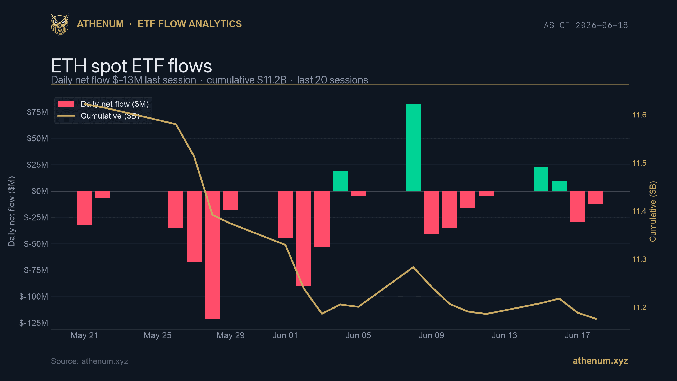
Athenum's ETF history for ETH makes that pattern explicit. Between March 19 and April 1 the dataset records eight outflow sessions and only two inflow days, producing a ten day cumulative net redemption of about 355.9 million US dollars while cumulative net inflows declined from roughly 11.96 billion to 11.55 billion.[2] The curve has not collapsed, but it has clearly rolled over from a persistent uptrend into a more tentative plateau.

Ten ETH ETF sessions that explain the rollover
The ten trading days covering March 19 through April 1 capture the full transition from steady accumulation to choppy, flow driven noise. Table one summarises the period using Athenum's ETH ETF history endpoint.
Date | Net flow (USD) | Cumulative net inflow (USD) |
|---|---|---|
2026-03-19 | -136,407,626.23 | 11,771,374,080.03 |
2026-03-20 | -41,971,485.98 | 11,729,402,594.05 |
2026-03-23 | -16,184,174.01 | 11,713,218,420.04 |
2026-03-24 | -40,800,260.78 | 11,672,418,159.27 |
2026-03-25 | -8,507,409.28 | 11,663,910,749.99 |
2026-03-26 | -92,544,772.72 | 11,571,365,977.27 |
2026-03-27 | -48,544,487.29 | 11,522,821,489.98 |
2026-03-30 | 4,958,297.27 | 11,527,779,787.25 |
2026-03-31 | 31,168,382.49 | 11,558,948,169.74 |
2026-04-01 | -7,104,665.77 | 11,551,843,503.97 |
In early March the ETH ETF curve was rising almost session by session. By late March that behaviour had changed. A series of sizeable outflows on March 19, March 20, March 24, March 26 and March 27 broke the earlier v shaped ascent and carved out a visible rounding pattern at the top of the cumulative curve.[2] The brief stabilisation on March 30 and March 31 was not enough to reset the trend and the April 1 outflow simply confirms that marginal ETF capital is now net withdrawing rather than adding.
From a positioning standpoint this sequence is better described as a slow bleed than a capitulation. Eight modest outflows in ten days remove value from the ETF wrapper without erasing the structural inflow story that built up more than eleven and a half billion US dollars of cumulative net demand.
Bitcoin ETFs are also leaking, but with a different rhythm
Ethereum is not the only asset experiencing pressure at the listed product level. Over the same ten trading days, Athenum's BTC ETF history shows six outflow sessions and a ten day net redemption of about 425.1 million US dollars, a somewhat larger bleed than ETH in absolute terms.[2] Cumulative BTC ETF net inflows remain close to 55.95 billion US dollars after the period, so here too the signal is about the sign of marginal flows rather than the existence of ETF demand.
The detailed breakdown for BTC across those ten sessions highlights a choppier rhythm.
Date | Net flow (USD) | Cumulative net inflow (USD) |
|---|---|---|
2026-03-19 | -90,189,632.73 | 56,283,255,297.01 |
2026-03-20 | -52,109,179.40 | 56,231,146,117.61 |
2026-03-23 | 167,229,236.35 | 56,398,375,353.96 |
2026-03-24 | -74,527,422.81 | 56,323,847,931.15 |
2026-03-25 | 7,806,864.84 | 56,331,654,796.00 |
2026-03-26 | -171,215,465.20 | 56,160,439,330.79 |
2026-03-27 | -225,476,321.98 | 55,934,963,008.82 |
2026-03-30 | 69,440,425.00 | 56,004,403,433.82 |
2026-03-31 | 117,632,799.08 | 56,122,036,232.89 |
2026-04-01 | -173,725,295.55 | 55,948,310,937.34 |
For BTC the flows flip sign more often and individual outflow days are larger, with March 26 and March 27 together removing almost 396 million US dollars before two sizeable inflow sessions partly rebuild the curve.[2] The April 1 print then takes another 173.7 million US dollars out of the structure and lines up with the same day ETH outflow that external media highlighted.

The combination of the ETH and BTC curves means that investors have been net reducing spot crypto exposure through regulated ETFs even while both products still show very large positive lifetime inflows. Athenum's ETF flow history, which aggregates individual product prints into asset level series, is what allows this marginal behaviour to be quantified session by session.
Orderbook imbalance shows where futures traders are leaning on ETH
ETF flows tell you how listed vehicles are gaining or losing assets over time. They do not show how intraday futures traders are actually leaning while those flows go through. Athenum's orderbook imbalance feed for ETHUSDT on Binance Futures fills that gap by comparing the resting bid and ask size across multiple depth buckets and labelling each interval as strong bullish, bullish, neutral, bearish or strong bearish.
Across the most recent twenty five minute snapshots at the five minute interval, the ETHUSDT orderbook imbalance series flags strong bearish conditions in the majority of intervals, with far fewer strong bullish readings and only a handful of neutral or mildly tilted states.[3] In practical terms that means that during recent microstructure windows, more size has been sitting on the offer than on the bid across the top twenty price levels of the futures book.
Conceptually, orderbook imbalance is a measure of how much passive liquidity is stacked on one side of the book compared with the other. When Athenum's ETH imbalance gauge reads strong bearish it is signalling that sell side depth dominates at the top of the book, so market orders that cross the spread are more likely to impact into a wall of offers than a wall of bids.[3] That configuration can coexist with only modest price moves if takers are not aggressively lifting liquidity, but it creates a setup where any burst of buying has to chew through more visible resistance than support.
Options and macro signals frame the ETF story
Athenum's options max pain series for ETH shows that the nearest expiry around April 3 carries a max pain level near 2075 US dollars while spot trades close to 2057 US dollars, leaving price less than one percent below the strike that minimises aggregate option holder profit and loss.[4] That tight gap implies that short dated options positioning remains clustered around current spot rather than being skewed toward far out of the money calls or puts.
On the macro side, Athenum's regime model currently labels conditions as neutral with low confidence. The underlying factors include a VIX reading near the mid twenties, a US high yield spread a little above three percent, a modestly positive two year minus ten year Treasury spread treated as risk on and a strong US dollar index around 120.9 that maps to a risk off contribution.[5] In aggregate those forces roughly offset one another, which is why the regime flag does not flip to outright risk on or risk off.
Recent macro commentary has focused on upcoming inflation data and the next Federal Reserve meeting, with several desks noting that a renewed oil driven inflation shock could constrain the space for rate cuts later in the year.[6][7] That backdrop helps explain why some investors are trimming higher beta exposures such as crypto ETFs even though there has been no single overwhelming macro shock.

What eight ETH outflow days in ten mean for risk management
Taken together, the ETF, orderbook and macro signals tell a consistent story about how ETH risk is being handled at the margin. ETF investors have shifted from persistent net buying into a phase where redemptions slightly outweigh creations, draining roughly 355.9 million US dollars from ETH wrappers over ten days while leaving more than 11.5 billion US dollars of cumulative net inflow intact.[2] Futures traders on Binance are leaning short in the resting orderbook during many recent intervals, but options positioning is still concentrated near the money and the macro regime is neutral rather than stressed.
For traders who care more about risk management than outright direction calls, the implication is that short squeezes and sharp intraday reversals are likely to be driven by local positioning and liquidity dynamics rather than sudden pivots in ETF demand. In a world where sell side depth dominates the ETH futures book and ETF flows are quietly negative, rallies that occur without a change in the flow pattern may have limited follow through unless they coincide with a change in macro tone or a rebalancing of orderbook imbalance toward more balanced conditions.
All of the ETF flow curves, orderbook imbalance labels, options max pain series and macro regime indicators referenced in this article are proprietary Athenum datasets built from exchange level data and macro feeds.[2][3][4][5] They are designed to make it straightforward to connect seemingly isolated events such as a single ETF outflow day to a wider positioning and macro context without relying solely on price.
In the near term, the key questions for ETH risk managers are whether ETF flows stabilise back toward flat or positive territory, whether orderbook imbalance readings revert toward neutral more often and how the macro regime flag evolves around the next set of inflation and central bank decisions. Watching those Athenum curves in parallel offers a structured way to track whether eight outflow sessions in ten was just a brief episode of de risking or the start of a more durable change in how listed ETH exposure is used inside portfolios.
How this flow episode compares with earlier ETH ETF behaviour
The current drawdown phase stands in contrast to the early life of ETH ETFs, when several weeks of almost uninterrupted inflows took cumulative net demand steadily higher. In January and early February, daily prints of a few million US dollars of inflow were common, and articles tracking those numbers highlighted how quickly listed ETH exposure was building inside portfolios that preferred regulated wrappers over direct holdings or perpetual swaps.[8][9] In that environment, short lived redemptions were usually followed by fresh creations as new capital arrived.
By March the tone had changed. Rather than sticky new money entering the structure, the Athenum curves now show more sessions where existing holders are redeeming units or switching between products. The fact that outflows are not concentrated in a single, catastrophic day but instead appear as a cluster of moderate redemptions is important. It points toward rebalancing and profit taking after a strong run rather than panic driven liquidations. That nuance is only visible when you drill down on the sequence of daily flows instead of treating month to date aggregates as a single statistic.
From a historical perspective, this kind of slow bleed episode is not unusual in ETF land. Equity and fixed income products frequently experience multi week strings of small outflows during periods of macro uncertainty or after strong performance, without those flow patterns necessarily predicting a sustained bear market. The key question is whether the behaviour persists and accelerates or whether it stabilises and eventually reverses as the macro backdrop and price action evolve.
Practical ways to track the next phase of ETH flows using Athenum
For desks that want to integrate these signals into their day to day process, a simple checklist built around Athenum's datasets can be useful. The first item is to monitor whether the share of outflow sessions in the ETH ETF history remains elevated. If eight out of ten days of redemptions gives way to a pattern where inflows and outflows roughly balance, the slow bleed narrative will lose force quickly. If, instead, the share of outflow days rises further and the ten day net redemption number grows, that would support the interpretation that ETF holders are in a more decisive de risk mode.
The second item is to pay attention to how orderbook imbalance behaves on days with and without ETF pressure. If Athenum's ETHUSDT imbalance readings remain strongly skewed to the sell side on outflow days but revert toward neutral or balanced conditions when flows are flat or positive, that would reinforce the link between ETF behaviour and derivatives positioning. Conversely, if the futures book starts to look more balanced or even bid heavy while ETFs continue to leak, that would suggest that short term traders are back to using derivatives to lean into potential squeezes even as longer horizon investors keep trimming listed exposure.[3]
A third item is to watch how the macro regime and key indicators such as the volatility index, high yield spreads and the dollar evolve around catalysts like inflation prints and central bank meetings. If the regime flag moves from neutral toward clear risk on territory while ETF flows remain negative, that divergence would become a signal in its own right and might argue for treating continued ETF redemptions as lagging behaviour. If, on the other hand, the macro flag slides into a more risk off stance and credit or volatility metrics deteriorate further, continued ETF outflows would fit a more defensive narrative.[5][6][7]
None of these metrics should be treated in isolation. The point of using Athenum's ETF, derivatives and macro datasets together is to build a layered view where flow, positioning and environment can either confirm or contradict one another. In this particular episode, the picture still leans toward a moderate and manageable reduction in listed ETH exposure, framed by short leaning orderbooks and a macro backdrop that is balanced rather than stressed. How that picture evolves over the next few weeks will depend on whether the numbers in these time series stabilise or keep moving in the same direction.
One terminal. All the data.
Liquidations, orderbook depth, whale walls & open interest from 4 exchanges, all real-time, in one place.
No credit card required

Athenum Analytics
Athenum Analytics is our three-person editorial team covering crypto derivatives, market data and macroeconomic context.