The average serious crypto trader spends over $5,500 a year on analytics tools and still can't see open interest and liquidations on the same chart. That number climbs past $18,000 if you want institutional-grade data. And somehow, after all that spend, you're still copying numbers between browser tabs like it's 2019.
Let me walk you through what the crypto analytics landscape actually looks like in 2026, what it costs, and why most of that money is wasted on fragmented tools that were never designed to work together.
The blockchain analytics market hit $3.5 billion in 2024 and is projected to reach $14 billion by 2030, growing at nearly 26% annually. That growth isn't driven by better products. It's driven by more products, each solving one narrow slice of the problem while ignoring everything else. The result is a Frankenstein stack that costs more than a Bloomberg Terminal and delivers a fraction of the coherence.
If you've ever had twenty browser tabs open across six platforms, each with its own login, its own symbol format, and its own definition of "real-time," you already know the problem. You just might not have calculated what it's actually costing you.
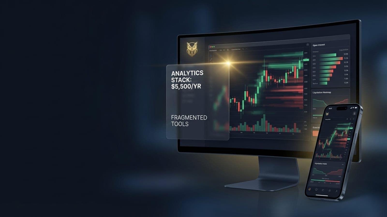
The $5,500 Spreadsheet
Let's do the math that most traders avoid. A mid-tier analytics stack in 2026 looks something like this.
TradingView Premium runs $59.95 per month. That gets you charting, alerts, and a handful of indicators. It's the default starting point for almost every crypto trader, and for good reason. The charting is excellent. But TradingView was built for traditional markets. Its crypto derivatives coverage is thin, and the free tier limits you to two or three indicators per chart.
Coinglass Prime costs $28 per month for aggregated open interest, funding rates, and liquidation data. Essential if you're trading perpetual futures, which accounts for 75% of crypto volume. Spot volume profiles without this context are misleading at best.
Hyblock Capital Advanced adds $99 per month for heatmaps, orderbook visualization, and backtesting tools. You need this to see where the liquidity actually sits, not just where price has been.
Laevitas Premium is $50 per month for options analytics. If you're trading or hedging with options, there's no substitute. If you're not, you're still missing implied volatility data that moves spot markets.
Glassnode Advanced at $49 per month covers on-chain metrics. SOPR, NUPL, exchange flows. The kind of data that tells you what long-term holders are doing while everyone else watches the one-minute candle.
CryptoQuant Professional adds $109 per month for exchange reserve tracking and miner flow analysis. There's overlap with Glassnode, but each platform has proprietary metrics the other doesn't.
Nansen Pro rounds it out at $69 per month for wallet labeling and smart money tracking. Nansen slashed their pricing by up to 95%, dropping from $999 to the $49-69 range. That tells you something about where the market is heading. Even the premium players are realizing that paywalling basic blockchain transparency isn't sustainable.
Add it all up. The mid-tier stack lands around $465 per month, or roughly $5,500 per year. And that's the moderate version. If you want top-tier plans across all these platforms, you're looking at $1,500 to $2,500 per month. That's $18,000 to $30,000 annually, approaching Bloomberg Terminal territory at roughly $32,000 per year for a single seat, except Bloomberg gives you a single integrated terminal and you're getting seven disconnected browser tabs.
Here's the part that should bother you. A trader with a $10,000 account paying $465 per month in tool subscriptions is burning 56% of their capital annually just on data access. Before a single trade is placed, more than half the account is gone to SaaS fees. Even at $50,000 in capital, that’s still an 11% annual drag. You need to outperform the market by 11% just to break even on your tools.
The Hidden Costs Nobody Talks About
The subscription fees are the obvious cost. The hidden costs are worse.
Fragmentation tax is a term that's starting to circulate in trading communities, and it deserves more attention. Research from Sumex estimates that traders lose over 26 hours per year just on login flows, two-factor authentication, and balance checking across multiple platforms. That's more than three full trading days spent on administrative overhead that produces zero alpha.
But the time cost is almost secondary to the cognitive cost. Context switching between platforms creates what researchers call decision fatigue, and the productivity hit is estimated at 40%. You're not just losing time. You're losing the mental clarity that separates a good trade from a mediocre one. Every time you alt-tab from your chart to check funding rates on a different platform, you're burning a small but real amount of cognitive bandwidth. Multiply that by dozens of switches per session, hundreds of sessions per year, and you start to understand why so many traders feel exhausted without being productive.
Then there's latency. Not network latency in the millisecond sense, though that matters too. Data latency. The gap between when something happens on an exchange and when your analytics tool shows it to you.
TradingView's webhook alerts have documented delays of 25 to 45 seconds under normal conditions. During high-volatility events, when alerts matter most, delays have been recorded as high as 3 minutes and 51 seconds. Glassnode updates its on-chain metrics every 10 to 15 minutes. CryptoQuant's baseline granularity is one hour.
In a market where even milliseconds of additional latency can cost six figures annually in missed arbitrage opportunities, a 45-second alert delay isn't an inconvenience. It's a structural disadvantage.
This is one of the reasons we built Athenum's backend in Rust. In our benchmarks, the Rust implementation processes data at 19.1 times the baseline speed, compared to 4.7 times for Node.js and 1.9 times for Python. Our data freshness target is under 10 seconds from exchange event to user-facing update, pulling directly from exchange WebSocket feeds rather than polling third-party APIs that add their own delays.
Why Your Data Is Fighting Against You
Even if you could afford every tool and had the cognitive endurance to juggle them all, there's a deeper problem. The data formats don't agree with each other.
Symbol mismatches are the most obvious example. Binance calls it BTC/USDT. Their API uses BTCUSDT. BitMEX uses XBT-USD. Bybit uses BTCUSDT but with different contract specifications than Binance. OKX uses BTC-USDT-SWAP for perpetuals and BTC-USDT for spot. If you're trying to compare open interest across exchanges, you first need a translation layer that most retail tools don't provide.
Timestamp drift is subtler and more dangerous. Each exchange runs its own clock. Most are close to UTC, but "close" in trading means different things at different timescales. When you're aligning one-minute candles across five exchanges to build a composite view, even a few hundred milliseconds of drift can put candles in the wrong bucket. The result is phantom divergences that look like trading signals but are actually synchronization artifacts.
Then there are the exchange API quirks that no documentation warns you about. OKX, Kraken, and Bybit all return errors with HTTP 200 status codes. The actual error information is buried in the response body. OKX uses a code field where anything other than "0" means failure. Kraken stuffs errors into an array. Bybit uses a retCode field. If your data pipeline checks only HTTP status codes, which is standard practice, it silently ingests error responses as if they were valid data.
Coinbase operates two entirely separate API systems. The Advanced Trade API at api.coinbase.com requires JWT authentication and uses different field names than the Exchange API at api.exchange.coinbase.com. The granularity parameter for candles is a string enum on one and a numeric value (60, 300, 900, 3600) on the other. Mixing calls between these APIs, which is easy to do because both are "Coinbase," produces confusing failures.
Kraken's OHLC endpoint is hard-capped at 720 candles regardless of pagination parameters. The since parameter only returns data after the given timestamp, making backward pagination for historical data impossible through their public endpoint. If you're building lazy-loaded historical charts, Kraken simply doesn't support it through the standard API.
These aren't edge cases. These are the everyday realities of building reliable cross-exchange analytics. Every platform you subscribe to either handles these quirks (and you trust their implementation) or doesn't (and your data is quietly wrong). Most retail tools handle some exchanges well and others poorly, and they rarely tell you which is which.
The Whale-Shaped Blind Spot
Here's a number that should reshape how you think about crypto markets. A small fraction of network entities control the vast majority of Bitcoin’s supply. Glassnode's analysis estimates that roughly 2% of entities control over 71% of all Bitcoin. Raw address counts suggest even higher concentration, but addresses and entities aren't the same thing. Either way, the distribution is stark, and it's on-chain math that anyone can verify.
A Federal Reserve research paper (Philadelphia Fed WP 24-14) confirmed what most experienced traders already suspected. Large holders, particularly in Ethereum, systematically increase their positions before price rises, while retail participants tend to reduce theirs. The smart money isn't just bigger. It moves first.
So the obvious question is: where can you track what whales are doing in real time, across multiple exchanges, with enough granularity to act on it?
The honest answer, for most traders, is nowhere.
On-chain analytics from Glassnode or Nansen can show you wallet movements after they hit the blockchain. That's useful for spot markets and long-term positioning. But for derivatives, where 75% of volume lives, the relevant whale activity happens in the orderbook. Large limit orders placed and pulled. Spoofing patterns where size appears and disappears to manipulate price. Iceberg orders that hide true size behind small visible quantities.
No retail tool in the $50 to $200 per month range offers cross-exchange spoof detection. The technology exists. Institutional surveillance platforms provide it, but at price points that run well into six or seven figures annually, designed for trading desks and hedge funds, completely inaccessible to independent traders.
This creates an asymmetry that goes beyond the usual "institutions have more capital" dynamic. Institutions can literally see market manipulation happening in real time while retail traders see only the price effect after the fact. You're not just outgunned on capital. You're outgunned on information.
October 2025 provided a stark illustration. Bitcoin's top-of-book depth contracted by over 90%, and bid-ask spreads ballooned from single-digit basis points to double-digit percentages. If you were watching only price and basic volume, the move looked like organic selling. If you could see the orderbook depth across exchanges, you could see that liquidity was being deliberately pulled, not consumed. Two very different readings. Two very different trade decisions.
This is why Athenum aggregates orderbook data across exchanges into a single normalized view. Seeing depth on one exchange tells you almost nothing in a market where participants routinely fragment their activity across venues specifically to avoid detection. Cross-exchange aggregation isn't a luxury feature. It's the minimum viable dataset for understanding what's actually happening.
What the Terminal Should Have Been
The Bloomberg Terminal solved the fragmentation problem for traditional finance decades ago. One login. One interface. One data model. Equities, fixed income, currencies, commodities, news, chat, analytics, execution. All in one place, all speaking the same language.
Bloomberg's approach (Views containing Pages containing Components) lets traders build custom workspaces where every piece of data is aware of every other piece. Select a bond and the credit default swap spread, the issuer's equity price, recent news, and the yield curve all update simultaneously. That contextual awareness is what makes it worth $32,000 per year to the institutions that pay for it.
Crypto has nothing equivalent. And the gap isn't just about price.
The fundamental problem is that crypto analytics evolved as point solutions. TradingView started as a charting platform. Glassnode started as an on-chain explorer. Coinglass started as a derivatives data aggregator. Each one excellent at its original purpose, but none designed to be part of an integrated system.
The result is that no mainstream platform offers open interest, funding rates, and liquidation cascades overlaid on a single price chart. Think about that. Three of the most important data streams for derivatives trading, the market that dominates crypto volume, and you can't see them together without manually cross-referencing multiple screens.
Only 9% of traders report being satisfied with their exchange user interfaces, according to industry surveys. That number is damning, but it's also unsurprising. The interfaces were designed for order execution, not analysis. And the analytics platforms were designed for analysis, not execution. The gap between them is where alpha goes to die.
What serious traders actually need isn't another dashboard. It's a composable workspace where derivatives data, on-chain metrics, and orderbook depth exist in the same coordinate system. Where selecting a timeframe on one panel propagates to every other panel. Where an open interest divergence triggers an alert that's aware of the current funding rate and recent liquidation clusters, not just a price level.
What We Are Building at Athenum
We started Athenum because we were the traders with twenty tabs open, paying $465 a month, and still feeling like we were flying blind on derivatives positioning.
The core architectural decision was to build a unified data layer rather than aggregating third-party APIs. Athenum connects directly to exchange WebSocket feeds, normalizes the data into a single format (handling all those symbol mismatches and API quirks at the ingestion layer), and stores everything in TimescaleDB for time-series queries that don't degrade as history grows.
Our range analysis page overlays OI profiles directly on the chart alongside price, funding rates, and liquidation levels. It's not four browser tabs. It's one view with one timeline, because that's how these data streams actually relate to each other. When open interest rises while price falls, you should see that divergence immediately, on the same chart, without mentally stitching together screenshots from different platforms.
The backend is Rust, not because it's trendy, but because data processing speed directly translates to data freshness. When a liquidation cascade starts, the difference between seeing it in 2 seconds versus 45 seconds is the difference between positioning ahead of the move and chasing it. Our WebSocket connections to exchanges feed into a pipeline that processes, normalizes, and serves data with sub-10-second latency from exchange event to chart update.
We pre-compute OHLC candles hierarchically. Ticks aggregate into one-minute bars, which aggregate into five-minute bars, up through weekly and monthly timeframes. Each level reads from the previous computed level, not from raw ticks. This makes timeframe switching essentially instant, even across months of history. It's a 100 to 2,800 times speedup over raw tick aggregation at query time.
For the chart rendering itself, we moved away from standard Canvas 2D (which TradingView's lightweight-charts library uses, capping out around 40,000 bars) to a WebGL implementation with instanced rendering. This lets us display 10 to 100 times more data points without the browser struggling. Pan and zoom are handled by GPU shader uniforms, not CPU-side coordinate transforms. The practical effect is that scrolling through years of one-minute data feels the same as scrolling through a week of daily candles.
We're not trying to replace every tool in the stack overnight. The on-chain analytics from Glassnode and Nansen are genuinely excellent, and we have no interest in poorly replicating what they do well. What we are focused on is the derivatives and orderbook layer, the part of the market where the majority of volume and price discovery actually happens, and where the existing tools are most fragmented and most expensive.
The pricing reflects the thesis that analytics shouldn't eat your trading capital. If your tools cost more than your edge produces, the tools are the problem, not your strategy.
The crypto analytics landscape in 2026 is simultaneously more advanced and more broken than it's ever been. The data exists. The tools exist. What doesn't exist, for most traders, is a way to see it all in one place without spending $32,000-a-year Bloomberg money on a Bloomberg-minus experience.
If you're trading derivatives and want to see what a unified analytics workspace actually looks like, start with our range analysis tools. Open interest overlaid on price, cross-exchange liquidation data, and funding rate context, all on a single chart. No twenty tabs required.